I recently saw a post on LinkedIn from Salma Sultana. If you don’t already follow Salma I encourage you to do so.
Salma covers a lot of ground in her post, citing an example from Scott Berinato’s book Good Charts where Berinato underscores the importance of sketching and how he and Walter Frick brainstormed on how to compare the cost of selected Apple products to median monthly household income, based on when those products were released.
I followed Salma’s link to a Harvard Business Review article and was struck by this proportional square chart, one of several in the article (Figure 1).
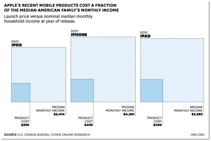
Figure 1—Proportional square chart from Harvard Business Review article. See https://hbr.org/2014/10/apple-luxury-brand-or-mass-marketer.
The big squares represent the median monthly income for the year the Apple product was released and the smaller squares embedded represent the costs for the associated Apple product.
“Ah,” I thought “yet another example of trying to show actuals and percentages at the same time.”
This need to show both comes up so often that I make sure to cover it in my dashboard design workshops. Here’s an example that shows Percent of Goal and Sales across four regions (Figure 2).
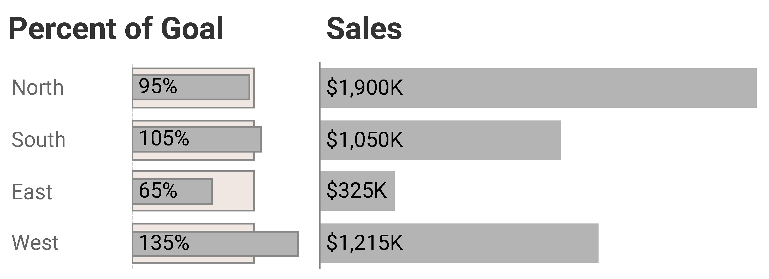
Figure 2–Showing Percent of Goal and Sales at the same time
It’s a combination of two charts. The bar-in-bar chart allows an easy comparison of percent of goals and the sales chart allows an easy comparison of actual sales.
So, how might we apply this approach (or something similar) to the Apple product costs data?
Actuals vs. Percentages, Take One
Before I go further, I want to make clear that I have no problems with the way the authors of the HBR article presented their data. As there isn’t a need to make accurate comparisons, the novel chart types are likely to draw readers in and the storytelling around the visualizations are entertaining and informative.
But being a professional chart-looker-atter I couldn’t help thinking “how would I show this, especially in a business setting where I may have to compare many products?” It would be difficult to make accurate comparisons across many proportional square charts as they take up a lot of space and people are better at comparing the length of bars than they are estimating the area of squares or circles.
With this in mind, let’s look at the raw data for six Apple products, the years they were introduced, the median monthly income for each year, and the associated product costs (Figure 3).
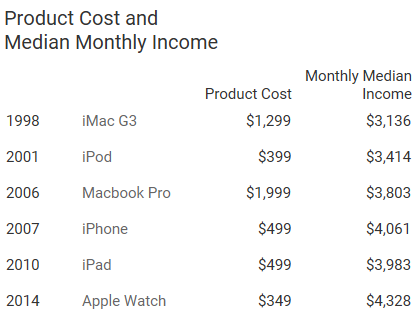
Figure 3–Table showing year, product name, product cost and monthly median income.
Below I present all this information in a compact space that I hope makes it easy for people to make accurate comparisons and better understand the data (Figure 4).
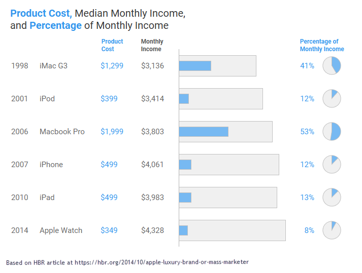
Figure 4–Product cost, monthly income, and percent of monthly income.
The bar-in-bar shows the actual product costs and actual median monthly incomes for each year / product while the pie charts (yes, pie charts!) shows the percentage, or “bite,” each product takes out of the median monthly income for that year.
Not So Fast! Actuals vs. Percentages, Take Two.
I conveniently left out products that had costs that were greater than the monthly median incomes for the year the product was released. Consider the table below that adds the Apple II and Macintosh to the list of products (Figure 5).
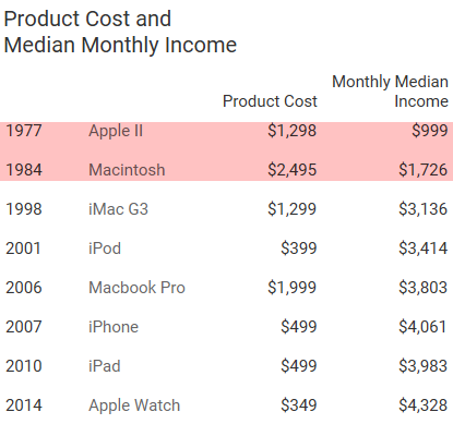
Figure 5–Highlighting two years when the selected Appl product costs more than the monthly median income.
How do we show more than 100% with a pie chart? Yes, I’m sure that Apple Watch enthusiasts are thinking about closing the rings on their watches and what the watch shows when you exceed goals (Figure 6).

Figure 6–How the Apple Watch shows when you have exceeded your fitness goals in two of the three categories. I’m not a big fan of the concentric circles.
In this case I would go with two bar-in-bar charts, like the one shown in Figure 7.
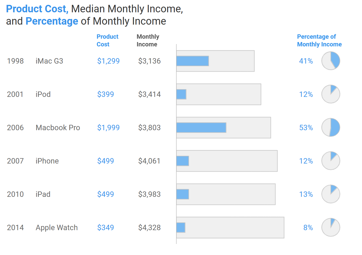
Figure 7–Bar-in-bar for actuals and percentages.
I think that many things that were buried in the table now become clear. For example, we can see the median monthly income almost doubled between 1984 and 1998. We can also see that those early Apple computers were very expensive!
Where to Learn More
This certainly isn’t the only way to show actuals and percentages at the same time. My fellow authors and I address challenges like these, that importance of sketching, and many other data visualization trials in the forthcoming book Dashboards That Deliver.
My thanks to Salma Sultana for both writing the original post and to Salma and Amanda Makulec for providing feedback on the article.