Business Visualizations

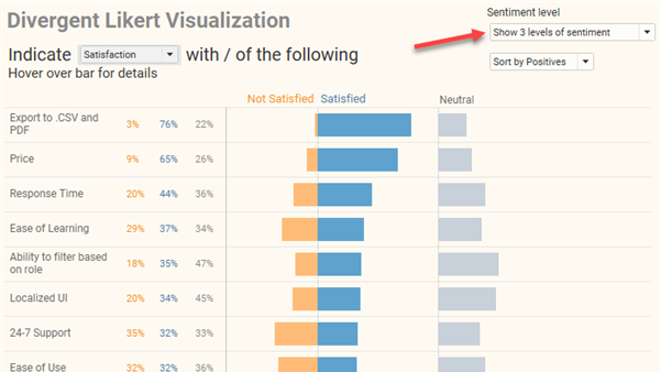
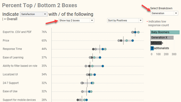
How to visualize Likert scale data broken down by different demographics

By |2021-09-06T16:58:48+00:00September 1st, 2021|Business Visualizations, General Discussions, Visualizing Survey Data|

Overview September 6, 2021 update: A big thanks to Chris Lay and Daniel Zvinca who chimed in on a variety of issues, the most important of which is that the margin of error is very large with a low response count. I've added an option to hide marks where the number of responses is fewer [...]

How to visualize Likert scale data in Tableau

By |2021-08-16T16:42:45+00:00August 16th, 2021|Business Visualizations, General Discussions, Visualizing Survey Data|

Note: A big thank you to Daniel Zvinca who wrote a wonderful article advocating the “inside-out” approach that I recommend here. Overview My preferred way to visualize Likert-scale data in Tableau is a little cumbersome to create and I suspect some audiences won’t find it intuitive. But it’s worth taking the effort to build, and [...]

Screaming Cats, Scaredy-Cats, and TURDs

By |2021-01-18T15:24:11+00:00January 18th, 2021|Business Visualizations, General Discussions, Makeovers|

January 18, 2021 Some thoughts about critique in data visualization. Background For the past 18 months I’ve been working on a new book (more on this in a moment). Last September, I asked some colleagues to review selected chapters. I asked everybody to review the preface, which included this passage: My friend Jonathan Schwabish provided [...]

WTF? Why doesn’t this survey data stuff work?

By |2022-08-03T21:39:44+00:00December 10th, 2020|Business Visualizations, Visualizing Survey Data|

Overview I’ve written almost ten years’ worth of blog posts on visualizing survey data using Tableau (see https://www.datarevelations.com/visualizing-survey-data/). The good news is that dozens of how-to articles that are currently on my website are relevant and the techniques work. That said, Tableau made a HUGE change in how you can model data with the release [...]

Set Controls and survey data – how to compare responses for this group vs that group vs overall

By |2020-09-30T14:24:58+00:00September 30th, 2020|Business Visualizations, Visualizing Survey Data|

September 30, 2020 Overview Tableau introduced Set Controls in 2020.2. Set Controls look like checkbox filters but instead of adding and removing data from a view they determine which elements are in a set and which are not. This feature can be very useful in visualizing survey data. But why not just use filters? [...]

Be careful what you amplify

By |2020-08-20T01:02:26+00:00July 19th, 2020|Business Visualizations, General Discussions, Health and Social Issues, Makeovers|

Be careful what you amplify And some thoughts on color palettes / color ramps Background This tweet got a lot of attention recently (see https://twitter.com/andishehnouraee/status/1284237474831761408?s=20) Figure 1 -- Tweet suggesting that Georgia is trying to hide something. While I did not retweet it, I did blindly chime in that this looked like gross incompetence, [...]

Should you use dashboards to tell stories or to find stories?

By |2025-02-04T17:06:45+00:00April 29th, 2020|Business Visualizations, General Discussions, Makeovers|

Should you use dashboards to tell stories or to find stories? You can’t tell a good story if you don’t understand the data, and a good dashboard will help you understand the data, faster. My thanks to Adam McCann, Athan Mavrantonis, Andy Cotgreave, and Jeffrey Shaffer for reviewing and providing feedback. Why do we [...]