Chart Chat Live — Round 8
Steve and Jeff discuss Animation and transitions Iron Viz 2019 https://youtu.be/9tkBl8k8BUU

Steve and Jeff discuss Animation and transitions Iron Viz 2019 https://youtu.be/9tkBl8k8BUU
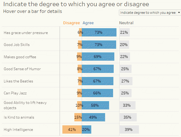
November 3, 2019 Overview Anyone that follows this blog or visits datarevelations.com to read articles on visualizing survey data know that I spend a lot of time thinking about how to present Likert scale data and what to do with neutral responses. I remain a stalwart supporter of some type of divergent stacked bar [...]
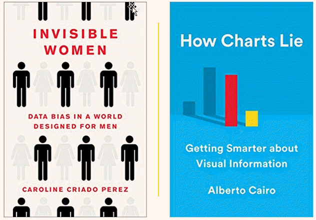
October 23, 2019 I’ve read some great books this year. Here are two that I think are noteworthy. Invisible Women: Data Bias in a World Designed for Men By Caroline Criado Perez My father was an ardent feminist. This was very rare for someone of his generation and I thought how lucky I was that [...]
Steve and Jeff discuss Kelly Martin How Steve spent his summer (a lot of reading) The importance of iterating Data Visualization Society survey Tableau animation (alpha release) https://youtu.be/C5TEXhqjx-E
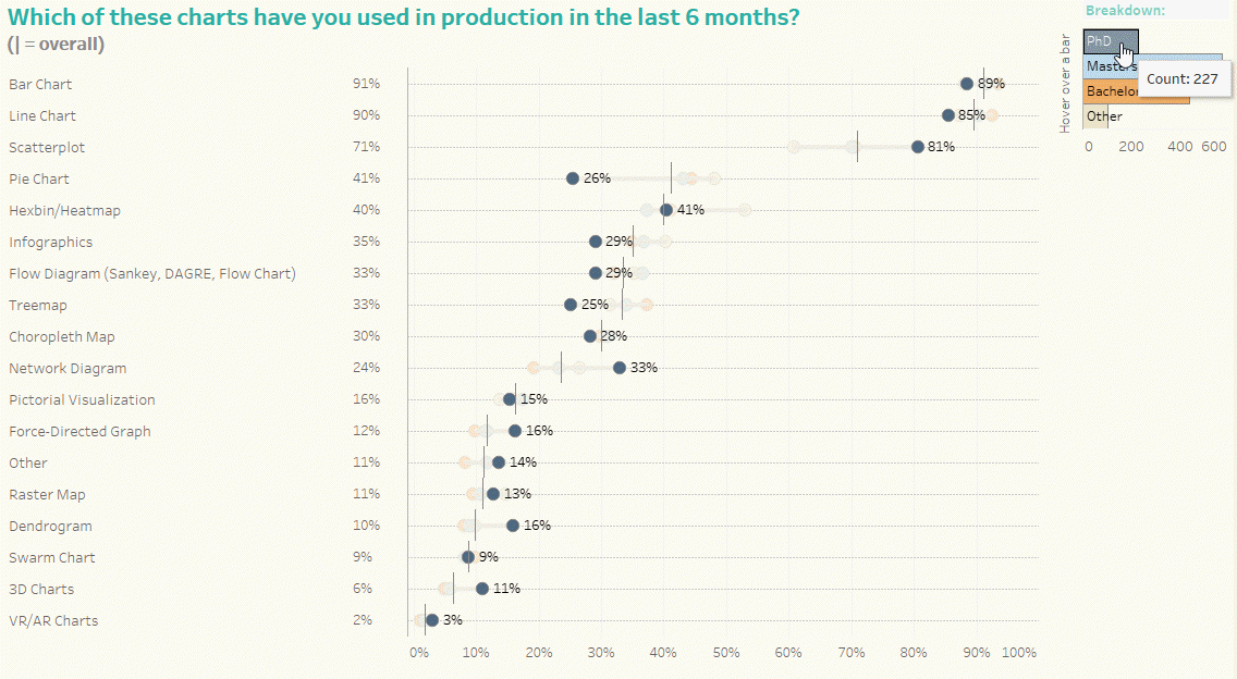
September 29, 2019 Overview 1,359 people participated in the 2019 The Annual Data Visualization Community Survey conducted by The Data Visualization Society (DVS). The survey covers professional data visualization details like salary and hourly compensation, tool use, location, demographic data, audiences, organizational structure, and more. I think this is an ambitious, bordering on heroic, [...]
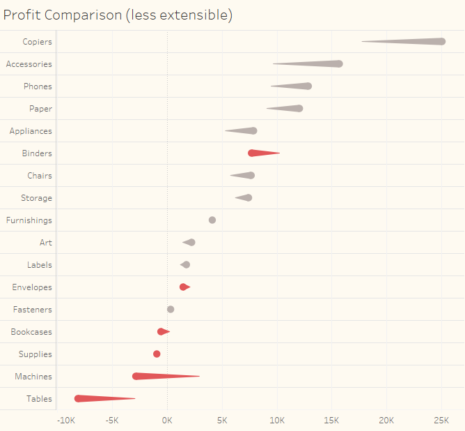
August 6, 2019 Overview Since the release of The Big Book of Dashboards in the Spring of 2017 I’ve received a lot of requests to explain how to build the Churn dashboard in Tableau. I’m glad I waited to write the post as my friend and colleague Klaus Schulte came up with a considerably [...]
July 15, 2019 Overview In the workshops I present attendees learn from each other as well as from me. Here are two oh-so-brilliant ideas that came from attendees. How to get your organization away from using green and red As Kelly Martin has written, in addition to red and green being so hard to [...]
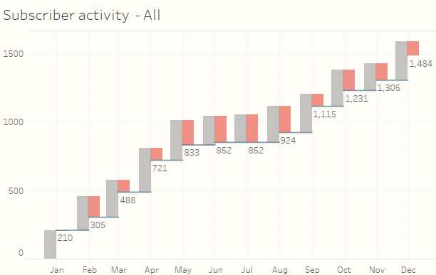
May 29, 2019 Overview Showing how a measure for one period compares with a previous period is a common need in data visualization. Here’s an example from one of the dashboards featured in The Big Book of Dashboards. Figure 1 -- "Ranking by now, comparing with then" dashboard from The Big Book of Dashboards. [...]
Steve and Jeff discuss Criticisms of our criticisms The cost of having a "large amplifier" Thoughts on Viz of the Day How to avoid having the tool dictate the visualization https://youtu.be/JJ3uh0fQN7U
Andy Cotgreave joins Steve and Jeff as they discuss Name the author Things that delighted Things that dismayed Adding music to augment a visualization Getting academic papers to be device responsive Bar Chart Races Invisible Women (Caroline Criado Perez) Critique in Data Visualization https://youtu.be/ktm5_yzeM-A