Visualizing Survey Data

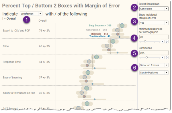
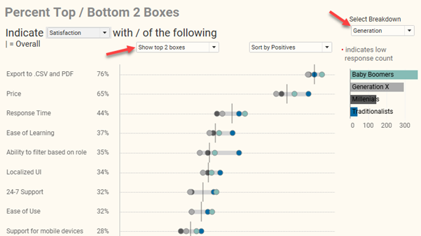
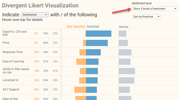
More thoughts on visualizing uncertainty in survey data

By |2023-10-04T23:28:36+00:00October 4th, 2023|Business Visualizations, Visualizing Survey Data|

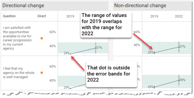
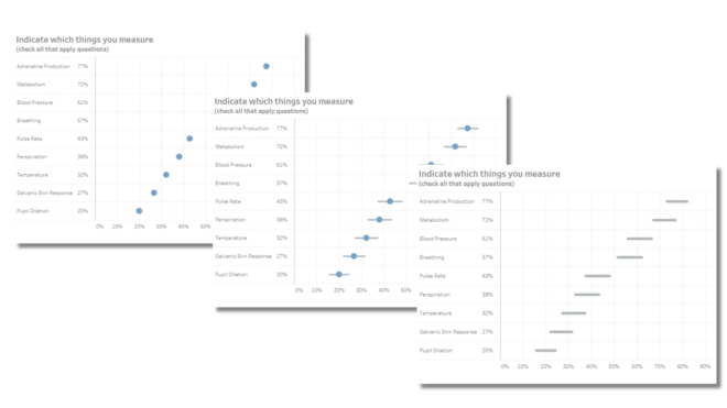
I recently participated in a LinkedIn Live discussion about how to visualize uncertainty in survey data with Bob Walker, Anna Foard, and Jon Cohen. I find myself contemplating whether we have a type of moral obligation to try to make sure our audience understands that there may be a big difference between the survey results [...]

Visualizing Uncertainty in Likert Data Over Time

By |2023-09-15T16:33:16+00:00September 13th, 2023|Business Visualizations, Visualizing Survey Data|

Helping your stakeholders see and understand margin of error in survey data. A deep thanks to Anna Foard and Jonathan Drummey for their assistance, Ben Jones for the foundational work behind for my initial explorations, and Ryan Corser for asking me to look into this. Update: an earlier version of this post was titled "Visualizing [...]

Likert Scale Questions the Zvinca Way

By |2023-07-24T17:35:46+00:00June 13th, 2023|Business Visualizations, Makeovers, Visualizing Survey Data|

Overview Although I was on vacation in April of 2023, I did see this twitter post. Daniel Zvinca’s response knocked my socks off. Here’s the post from Cole Knaflic. And here was Daniel’s response. “Goodness, yes” I thought. This addresses the shortcomings of what I’ll call the “inside out” approach for displaying Likert scale survey [...]

Getting SurveyMonkey data to play nicely with Tableau

By |2023-01-04T17:11:55+00:00January 3rd, 2023|Business Visualizations, Visualizing Survey Data|

I’ve received a lot of requests to address the unique (and annoying) issues with getting SurveyMonkey data to play nicely with Tableau. The good news is that once you know where the stumbling blocks are it’s not very difficult to get your data “just so” so that you can create clear visualizations that provide solid [...]

More thoughts on showing Margin of Error in survey data with Tableau

By |2021-11-18T14:07:27+00:00November 17th, 2021|Business Visualizations, General Discussions, Visualizing Survey Data|

A big “thank you” to Daniel Zvinca, Chris Lay, Anna Foard, Jeffrey Shaffer, and Joe Cohen for their feedback and encouragement. Overview I published a blog post earlier this year on how I recommend showing results for Likert-scale questions broken down by different demographics. I had become fond of how organizations like Pew Research does [...]

How to visualize Likert scale data broken down by different demographics

By |2021-09-06T16:58:48+00:00September 1st, 2021|Business Visualizations, General Discussions, Visualizing Survey Data|

Overview September 6, 2021 update: A big thanks to Chris Lay and Daniel Zvinca who chimed in on a variety of issues, the most important of which is that the margin of error is very large with a low response count. I've added an option to hide marks where the number of responses is fewer [...]

How to visualize Likert scale data in Tableau

By |2021-08-16T16:42:45+00:00August 16th, 2021|Business Visualizations, General Discussions, Visualizing Survey Data|

Note: A big thank you to Daniel Zvinca who wrote a wonderful article advocating the “inside-out” approach that I recommend here. Overview My preferred way to visualize Likert-scale data in Tableau is a little cumbersome to create and I suspect some audiences won’t find it intuitive. But it’s worth taking the effort to build, and [...]

WTF? Why doesn’t this survey data stuff work?

By |2022-08-03T21:39:44+00:00December 10th, 2020|Business Visualizations, Visualizing Survey Data|

Overview I’ve written almost ten years’ worth of blog posts on visualizing survey data using Tableau (see https://www.datarevelations.com/visualizing-survey-data/). The good news is that dozens of how-to articles that are currently on my website are relevant and the techniques work. That said, Tableau made a HUGE change in how you can model data with the release [...]

Set Controls and survey data – how to compare responses for this group vs that group vs overall

By |2020-09-30T14:24:58+00:00September 30th, 2020|Business Visualizations, Visualizing Survey Data|

September 30, 2020 Overview Tableau introduced Set Controls in 2020.2. Set Controls look like checkbox filters but instead of adding and removing data from a view they determine which elements are in a set and which are not. This feature can be very useful in visualizing survey data. But why not just use filters? [...]