How do you explain what data visualization is and how helpful it can be? Join the discussion here.

Background
I recently had to address some serious health issues that required a lengthy hospital stay followed by a long in-patient rehab. I won’t go into the details, but over the course of my stays people would ask me what I did for a living.
I would answer I was involved in data visualization.
Not one person who asked knew what that was, so I would try to explain what I did.
Sometimes it was easy, like when I had a follow up appointment where I was tethered to an EEG monitor for five days and it produced a real-time chart like the one shown here.

Sparklines, sparklines, sparklines! If you are into sparklines, it doesn’t get better than this!
I would then point out that if you know how to read this constantly changing chart (I certainly don’t… same with MRIs), it was a lot easier than trying to read a constantly changing table full of numbers.
But for the people who were not involved with the real-time EEG monitor… how would I explain what data visualization is and how it could be so useful for the people trying to care for me?
Trying to explain without being able to show
It was hard not to lean into Tableau’s mission statement and say that “I help people see and understand data.” I would provide examples of where a really good chart–or a combination of charts–would reduce time to insight. Indeed, time to insight became the driving force of getting people to see the value of data visualization. In this setting we weren’t interested in getting people to “feel” something about the data.
We discussed everything from the number of patients on the floor, to how long they stayed, to time to respond to patient call bells, to the most pernicious of all the things I saw during my stay: the 1970s-styled lab reports.
You know them, the reports that show albumin levels, cholesterol, white blood cell counts, etc. You see your numbers and the “acceptable” range.
What happens when you fall out of the acceptable range? How far out of the range are you? When should you be mildly concerned and when should you panic? Is it easy to see this? I wrote about this in my book The Big Picture and shared an example that Amanda Makulec presented at a visualization conference several years ago. Here’s a snippet from the book.
Reimagining Lab Tests
Amanda Makulec is a consultant and Executive Director at the Data Visualization Society. After her father had a second battle against kidney cancer, Makulec decided that she should submit to a genetic test and discovered that she, like her father, had Lynch syndrome that put her at greater risk for several different types of cancers. The lab results she received were presented in a table like the one shown in Figure 9.44
Lots of body parts, lots of numbers, and lots of red. And a lot of frustration with the way the data was presented.

It’s hard not to be particularly alarmed by the first set of numbers (55%–82%) and just focus on the 82%, suggesting a four out of five risk of that body part developing cancer.
Armed with both a master’s degree in public health and data visualization expertise, Makulec could interpret the results but wondered about those not as well steeped in reading and understanding health-related numbers. She wished the testing company had presented the results this way instead.
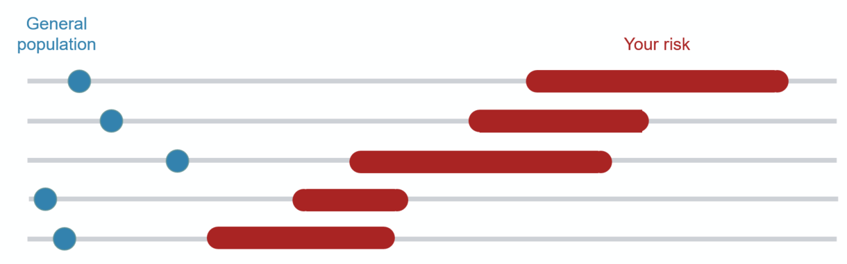
If you are wondering why there is a dot for the general population and a very wide range for Makulec, it’s because of the amount of data the testing organization maintains. They have a great deal of data about the general population but sparse data from people with Lynch syndrome, so the margin of error is very wide, hence the wide range bars.
These institutions can do better
I’m scratching my head wondering why these institutions do such a poor job with both lab reports and operations data (I probably shouldn’t be scratching my head as there are still some scarring). I’m sure if the data visualization community got the chance, we could help make both the internal operations data and the patient-facing data so much easier to interpret.
What do you think about this and again, how do you explain what you do and how data visualization can help? Join the discussion here.
Note: the in-patient rehab where I recovered for two weeks was so helpful I plan to volunteer my services. I am very grateful to them.