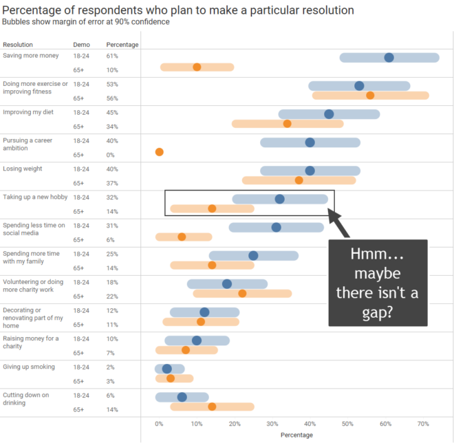
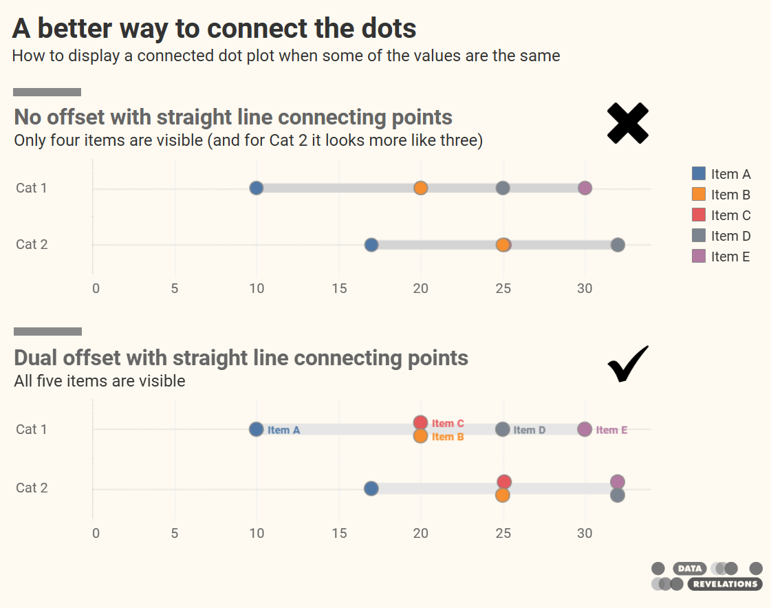
Steve’s Blog

Actuals? Percentages? Why not show BOTH?

By |2025-04-07T01:15:37+00:00April 7th, 2025|Business Visualizations, General Discussions, Makeovers|

I recently saw a post on LinkedIn from Salma Sultana. If you don’t already follow Salma I encourage you to do so. Salma covers a lot of ground in her post, citing an example from Scott Berinato’s book Good Charts where Berinato underscores the importance of sketching and how he and Walter Frick brainstormed on [...]

A Haiku about color in data visualization

By |2025-01-08T17:44:35+00:00January 8th, 2025|Business Visualizations|

I think the number one infraction in data visualization is the misuse of color. If I were pressed for time and had to distill my recommendations on color into a Haiku, it would be this: Make everything gray Except the few things you think Should be highlighted Yes, this is simple, bordering on the simplistic, [...]

Why I Quit X (Twitter)

By |2024-10-01T16:43:04+00:00October 1st, 2024|General Discussions|

Last week I saw a reprehensible and delusional post from Elon Musk on his social media platform, X. Shortly thereafter I read Robert Reich’s Guardian opinion piece on how Elon Musk has gained a concerning level of power over US national security. For certain, Musk is a genius. He is our era’s Thomas Edison and [...]

How do you explain what data visualization is?

By |2024-07-23T12:56:58+00:00July 23rd, 2024|Business Visualizations, General Discussions, Health and Social Issues|

How do you explain what data visualization is and how helpful it can be? Join the discussion here. Background I recently had to address some serious health issues that required a lengthy hospital stay followed by a long in-patient rehab. I won't go into the details, but over the course of my stays people would [...]

How many lines are too many?

By |2023-11-28T22:11:04+00:00October 26th, 2023|Business Visualizations, Makeovers|

And how many colors are too many, too? Overview There are a lot of ways to show measures over time for multiple categories. I want to explore what works, when it works, and make sure that a particular technique catches your interest. But first… a big shout out to Nick Desbarats whose book, Practical Charts, [...]

More thoughts on visualizing uncertainty in survey data

By |2023-10-04T23:28:36+00:00October 4th, 2023|Business Visualizations, Visualizing Survey Data|

I recently participated in a LinkedIn Live discussion about how to visualize uncertainty in survey data with Bob Walker, Anna Foard, and Jon Cohen. I find myself contemplating whether we have a type of moral obligation to try to make sure our audience understands that there may be a big difference between the survey results [...]

Visualizing Uncertainty in Likert Data Over Time

By |2023-09-15T16:33:16+00:00September 13th, 2023|Business Visualizations, Visualizing Survey Data|

Helping your stakeholders see and understand margin of error in survey data. A deep thanks to Anna Foard and Jonathan Drummey for their assistance, Ben Jones for the foundational work behind for my initial explorations, and Ryan Corser for asking me to look into this. Update: an earlier version of this post was titled "Visualizing [...]

Monday Music Musings – No, that’s not James Jamerson, Part 2

By |2023-08-14T14:36:58+00:00August 12th, 2023|Music Musings, Sports and Entertainment|

I wrote previously about a great bassline that people attribute to James Jamerson, but was performed by then 18-year-old Michael Henderson. Here's another bassline that sounds like Jamerson, but isn't. In 2015 the music world lost Wilton Felder. Most people familiar with Felder know him as a brilliant saxophone player and founding member of the [...]