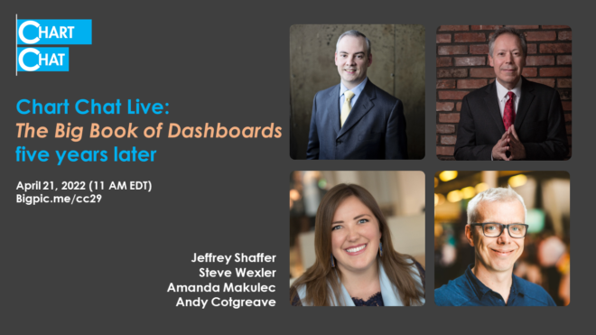
Chart Chat Live — Round 29
Amanda Makulec interviews Steve, Jeff, and Andy as they reflect on The Big Book of Dashboards, five years later. https://youtu.be/kVh7I6gFB_c

Amanda Makulec interviews Steve, Jeff, and Andy as they reflect on The Big Book of Dashboards, five years later. https://youtu.be/kVh7I6gFB_c
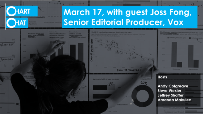
A look behind the scenes of the making of Joss Fong's amazing Pandemic Polarization video for Vox.com. https://youtu.be/RhglcxOp9Xo
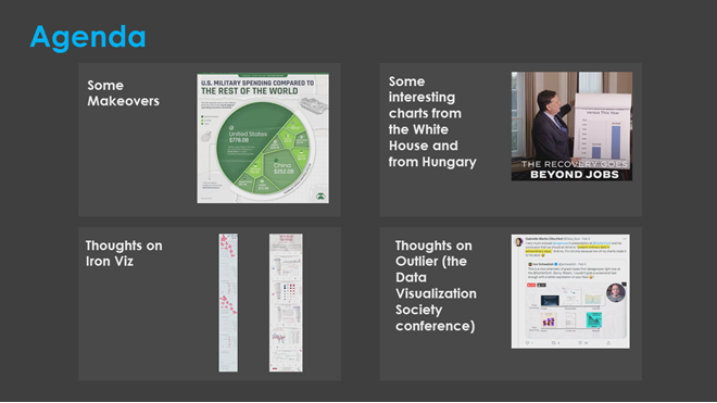
Different approaches to making over a Veronoi treemap, some disturbingly similar charts from Viktor Orban and Joe Biden, thouhts on Iron Viz, and reflections on Robert Kosara's 2022 Outlier presentation. https://youtu.be/03_VLfY_aFI
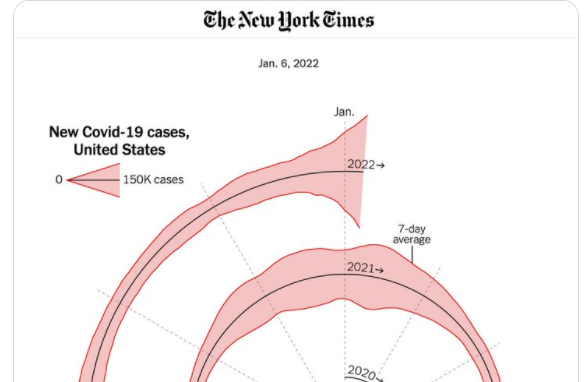
A retrospective of some of our favorite visualizations and tools from 2021 and a discussion of the New York Times Covid "Spiral" chart that went viral. https://youtu.be/xchgcYNTs98
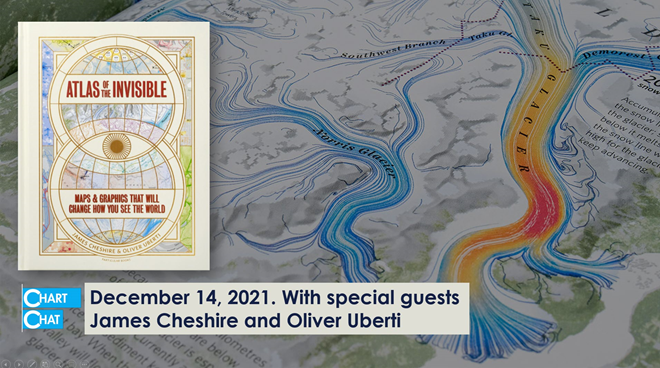
Our discussion with James Cheshire and Oliver Uberti. James and Oliver share how they developed some of the striking illustrations for Atlas of the Invisible. https://youtu.be/YwgqWaV5lZw
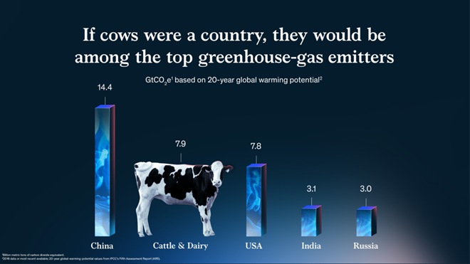
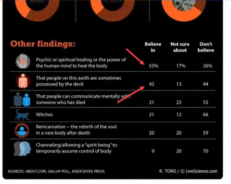
So many wonderful things from 2021. In this post I share my favorite chart, channel, chat, and tool. My favorite chart: If cows were a country I love this McKinsey gem from Jason Forrest, Gabrielle Merite, and Gergo Varga. I know, it violates so-called best practices. The bars are 3D (they look like smoke-filled containers) [...]
A big “thank you” to Daniel Zvinca, Chris Lay, Anna Foard, Jeffrey Shaffer, and Joe Cohen for their feedback and encouragement. Overview I published a blog post earlier this year on how I recommend showing results for Likert-scale questions broken down by different demographics. I had become fond of how organizations like Pew Research does [...]
And some other thoughts on conditional formatting. Overview A few weeks ago my friend, Yamil Medina, asked me to attend a weekly livestream he hosts with his colleague at Data Meaning, Aaron Simmons. The livestream is called 3@3: A Mystery Chart Show and I enjoyed it so much I decide to hangout the following week. [...]
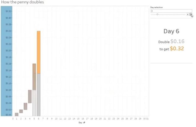
Understanding Index Charts and Log Scales https://youtu.be/Kzee9HyX6bU Index Charts are a great way to compare events that don't happen at the same time; for example, how are sales this quarter vs. last quarter, vs. a year ago this quarter? There are lots of business cases for this type of chart. What about log scales? [...]
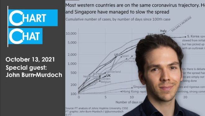
Our discussion with John Burn-Murdoch, Chief Data Reporter at The Financial Times. John takes us behind the scenes in the creation and evolution of some of the most influential charts of the pandemic. https://youtu.be/U0aHxx6lhz0