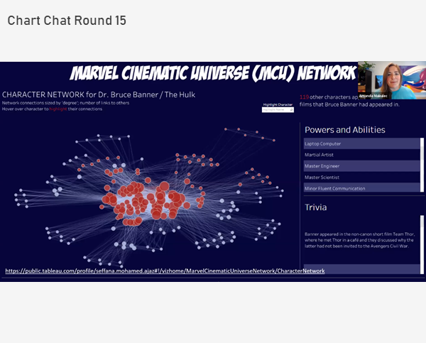
Chart Chat Live — Round 18
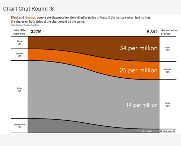
In this Chart Chat we reflect on Sankey and proportion charts, unit charts, unemployment charts and presenting complex data. https://youtu.be/IIirXyOcbeQ

In this Chart Chat we reflect on Sankey and proportion charts, unit charts, unemployment charts and presenting complex data. https://youtu.be/IIirXyOcbeQ

The best encapsulation I’ve heard of the past year comes from a colleague, Jon Cohen of SurveyMonkey, who saw this twitter post: There’s so much to be grateful for, but so little to be happy about. I am very grateful that there remains a demand for my services, but I [...]

January 18, 2021 Some thoughts about critique in data visualization. Background For the past 18 months I’ve been working on a new book (more on this in a moment). Last September, I asked some colleagues to review selected chapters. I asked everybody to review the preface, which included this passage: My friend Jonathan Schwabish provided [...]
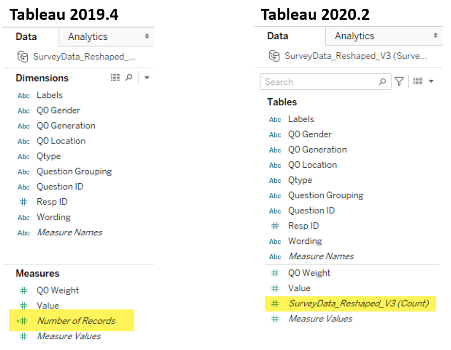
Overview I’ve written almost ten years’ worth of blog posts on visualizing survey data using Tableau (see https://www.datarevelations.com/visualizing-survey-data/). The good news is that dozens of how-to articles that are currently on my website are relevant and the techniques work. That said, Tableau made a HUGE change in how you can model data with the release [...]
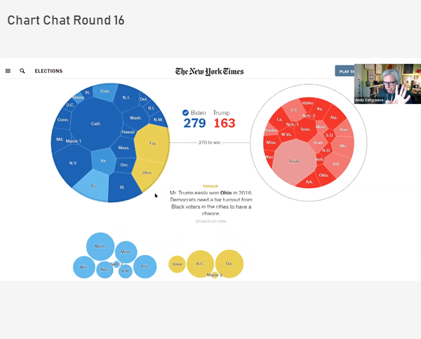
In this Chart Chat we reflect on a night of election vizzes, the lack of innovation and clarity (with the exception of the tie gauge, frownometer, and chipped cartogram) and whether we should access all visualizations based on precision (spoiler alert:NO!). https://youtu.be/xa2T-dIA-T0
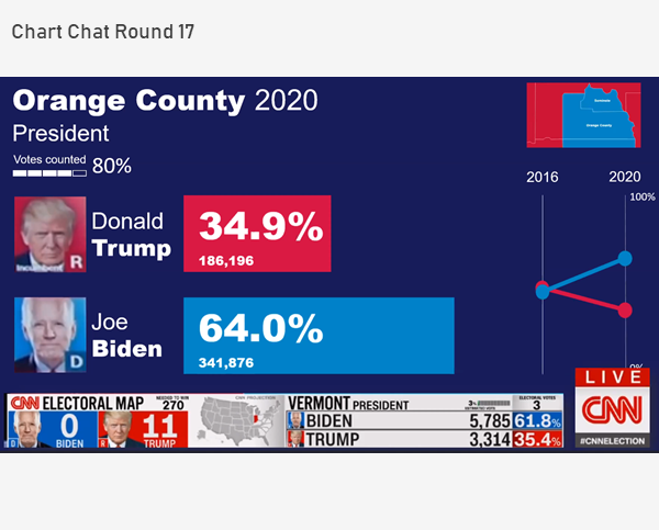
In this Chart Chat we discuss election trackers and showing uncertainty. https://youtu.be/STk6n3JJGvE

September 30, 2020 Overview Tableau introduced Set Controls in 2020.2. Set Controls look like checkbox filters but instead of adding and removing data from a view they determine which elements are in a set and which are not. This feature can be very useful in visualizing survey data. But why not just use filters? [...]
In this Chart Chat we discuss waffle and unit charts, Iron Viz, a new approach to visualizing a P&L statement, and contact tracking visualizations. https://youtu.be/-q3ZTmWkQV8
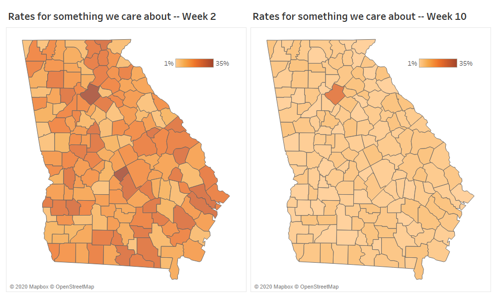
Be careful what you amplify And some thoughts on color palettes / color ramps Background This tweet got a lot of attention recently (see https://twitter.com/andishehnouraee/status/1284237474831761408?s=20) Figure 1 -- Tweet suggesting that Georgia is trying to hide something. While I did not retweet it, I did blindly chime in that this looked like gross incompetence, [...]
In this Chart Chat we interview Len Kiefer, Deputy Chief Economist at Freddie Mac, explore problems with how the Georgia Department of Health visualizes Covid-19 data, and a discussion around our role as data visualization people to promote anti-racism. https://youtu.be/s-9Tix91TOI