Chart Chat Live — Round 13
In this Chart Chat we'll look at "Modern" dashboard design, how NBC reported unemployment in the US, The "seven circles of hell" chart and more. https://youtu.be/SILoC-FLF-E

In this Chart Chat we'll look at "Modern" dashboard design, how NBC reported unemployment in the US, The "seven circles of hell" chart and more. https://youtu.be/SILoC-FLF-E

Should you use dashboards to tell stories or to find stories? You can’t tell a good story if you don’t understand the data, and a good dashboard will help you understand the data, faster. My thanks to Adam McCann, Athan Mavrantonis, Andy Cotgreave, and Jeffrey Shaffer for reviewing and providing feedback. Why do we [...]
In this Chart Chat we'll look at the Index Chart popularized by the Financial Times and how and why you should use it in your own organizations, how the New York Times reported record unemployment claims (Jeff liked it, Steve hated it), issues around data humanism, some of the best work we've seen over [...]

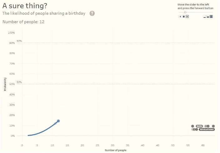
Overview I've written previously about how difficult it can be not to get sucked into the 24/7 Coronavirus vortex. I'm trying to be mindful of who and what I follow and wanted to share this. The person I watch I encourage you to watch New York Governor Andrew Cuomo's daily press briefings, even if [...]
In this special Chart Chat Steve, Jeff, Amanda, and Andy try to give you the tools to parse and filter the barrage of data visualizations around the Coronavirus. We'll look at the history behind the "flatten the curve" diagram, why that curve is likely to be bumpy, how certain visualizations are truly helping people [...]

Why you should continue to listen to music, read good books, and post funny videos As I sit sequestered in my home with my wife and dog, I find myself sucked into a funk as every conversation, news article, twitter post, etc., is about the Coronavirus. Right now, music, TV, books, and work all [...]
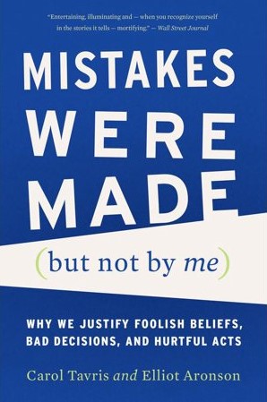
Mistakes Were Made (but Not by Me) Why We Justify Foolish Beliefs, Bad Decisions, and Hurtful Acts by Carol Tavris and Elliot Aronson This book explains so much that I find troubling about the world, from politicians doubling and tripling down when they should know better, to prosecutors refusing to believe DNA evidence, to [...]
Steve, Jeff, and Amanda discuss The Data Visualization Society anniversary Voronoi charts Longform dashboards Visualizing the Coronavirus https://youtu.be/oLikbETEtuU
February 3, 2020 A fun ice-breaker exercise A few weeks ago my friend and colleague, Jason Forrest, asked if I would fill in at the last minute for an ailing speaker at the New York Data Visualization Society Meetup. Seeing that the meetup had drawn a nice crowd, a few minutes before the presentation [...]
Amanda Makulec joins Steve and Jeff and they discuss The Data Visualization Society Mona Chalabi and Marimekko charts Grammar of graphics and comparing Tableau with Power BI Curved timelines https://youtu.be/fSyMMrVkDEM